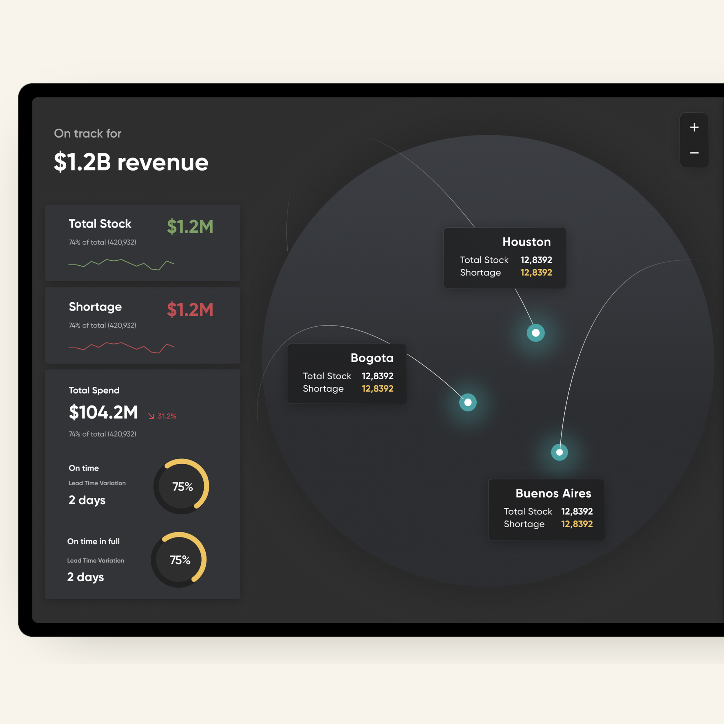
Brium
Refreshing a Time Tracking Tool
I was UX designer tasked with the redesign of Brium, a chat based time tracking tool. Originally created as an in-house tool, Brium was packed with numerous features, many of which were rarely used. The goal was to make it more user-friendly, modern and marketable to other companies.

The Original
The original app had an outdated design as well as ton of features, we wanted to find out which were is relevant, and which people may not even be using.


Talking to Current Users
I began by interviewing and polling current users about the various sections and tasks to gather insights on their usage patterns and pain points.
I found that the users were only using only a handful of the current features.

Jobs to be Done
This was followed by a detailed Jobs to be Done (JTBD) analysis to understand the specific tasks users were trying to accomplish with Brium. By removing redundant and rarely used features, we aimed to create a cleaner, more intuitive interface.

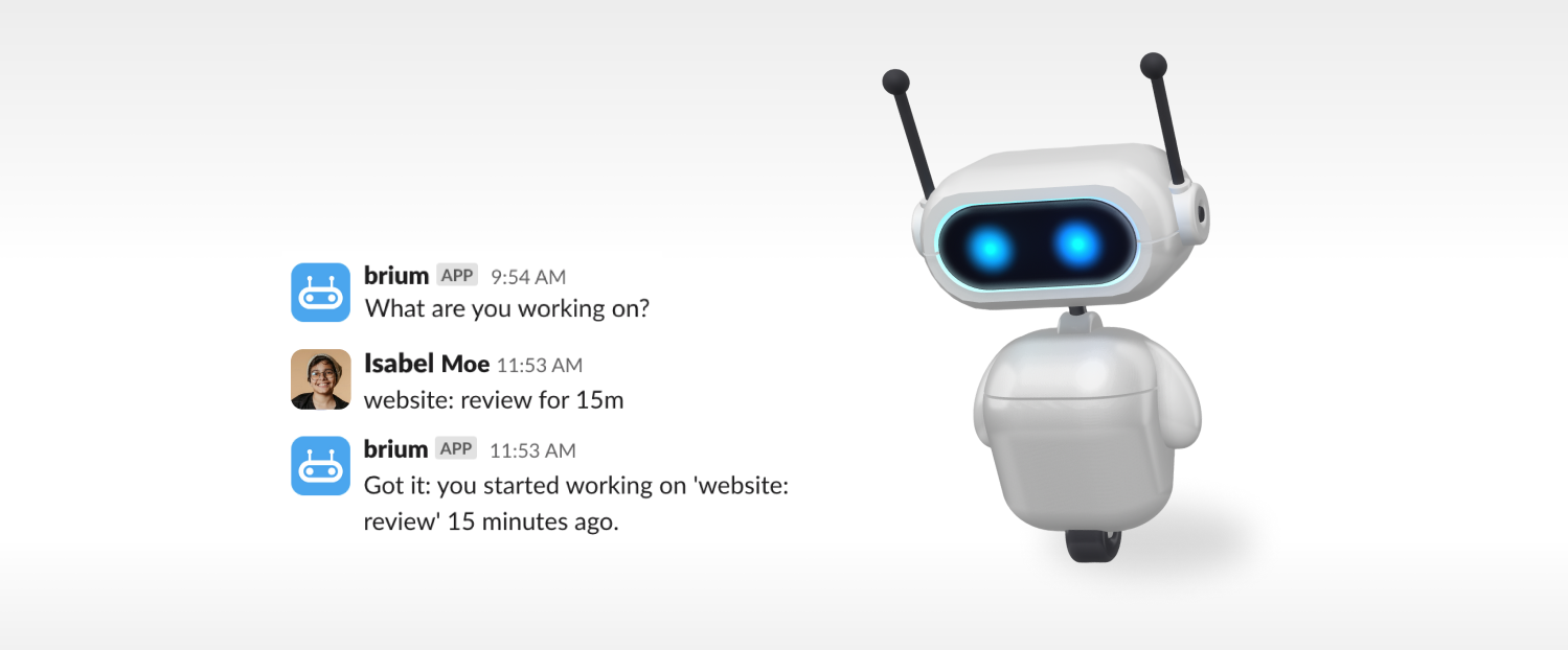
Adding Entries
For the current users, the most popular method for adding entries is through Slack, and recording entries through an integrated chat tool remain one of its unique and essential features. However, to market Brium to companies that might not use Slack or prefer not to rely on a specific integration, I needed to give a refresh to the method of adding entries through the platform itself.
I conducted competitive research to analyze how other time management tools handled project entries.
Based on my findings, I implemented a prominent entry bar on the app's homepage. This allows users to easily enter their tasks, start a timer, pause, or stop working. This streamlined approach enhances usability and broadens Brium's appeal to a wider audience.

Microinteractions
I added microinteractions to enhance the user experience by providing intuitive feedback and guidance and making the process more efficient, engaging, and user-friendly.
I included shortcuts and tips during task entry to make the process easier to learn.
When a task is running, clicking on the entry bar shrinks and moves the task to the top, keeping the interface organized and allowing room for a new entry while clearly indicating the ongoing task. This design also lets users easily revert to the original task state if they change their minds.

Managing International Teams
To better serve remote and international teams, we redesigned the holidays functionality. Previously, each holiday had to be manually updated in a spreadsheet, requiring cumbersome workarounds to accommodate employees in different countries.
In the new Brium system, calendars are integrated, allowing managers to effortlessly assign different countries' holidays to their employees. Additionally, managers can choose to let users view all upcoming holidays for their coworkers or team.

Visual Refresh
A key part of this project was revamping the app's visual design to make it more functional and aesthetically pleasing. We went for a minimalist look, simplifying the color palette to cut down on visual clutter and highlight important elements.
By adding more white space, I made the layout feel more open and easier to navigate. I also included subtle animations and micro-interactions to make the user experience more intuitive and engaging.

Mobile Version
I designed a simplifed mobile version which can be downloaded as an app.


I gave the robot mascot an refresh using Spline.

Working on Brium was a fantastic opportunity to enhance an app by focusing on simplicity and user needs. By engaging directly with users and conducting thorough research, we identified key pain points and unused features, allowing us to streamline the app and make it more intuitive and modern.